Design your Labels With Label Editor
Label Editor is a simple tool that helps you create professional labels quickly and easily. It's made for anyone who needs custom labels - whether you're preparing product labels for Amazon or Walmart, organizing items for storage or shipping, or just need clear and consistent labels for business or personal use.
It's easy to customize your layout, choose label sizes, and adjust how things are placed on the canvas. Whether you're designing one label or hundreds, Label Editor gives you the flexibility to do it all in one place.
Once you've created your label design in Label Editor, you can use it to generate labels both on our website and through the Label Resizer browser extension. Whether you're resizing label PDFs downloaded from e-commerce platforms or generating new labels based on your own data from a spreadsheet, your saved design can be applied seamlessly. This gives you full control over how your labels look.
In this section of the how-to guide, we'll provide a general introduction to the editor's interface. To make it easier to understand, each block of the interface is outlined in a different color.
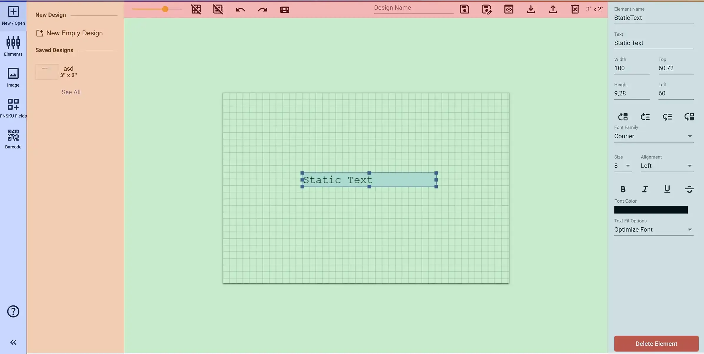
Main Tool Panel
The main tool panel (purple area) contains the tools for interacting with your design. All tools are grouped in this panel. Once you make a selection, the corresponding tools from that group will appear in the side menu (orange area).
- New / Open Menu: Allows you to create a blank design and access actions for existing designs.
- Elements Menu: Includes options to add text, item numbers, and basic shapes.
- Image Menu: Lets you upload images from your computer, and provides predefined warning images, transparency logos, and general icons.
- FNSKU Fields Menu: Contains Amazon-specific fields.
- Barcode Menu: Supports adding both 1D and 2D barcodes.
Content Panel
The Content panel (orange area) displays context-specific content based on what you select in the main toolbar. For example, when you click on 'Image' or 'Barcode', this area updates to show related content.
Top Action Bar
The Top Action Bar (outlined in red) contains the main editor controls such as saving your design, undo/redo actions, zoom settings, and export options.
- Zoom: Zoom in and out of the canvas.
- Grid: Toggle a grid on the canvas to help with alignment.
- Snap: When enabled, elements snap to the grid for easier alignment.
- Undo / Redo: Move backward and forward between actions performed on the canvas.
- Save: Saves the design you created on the canvas by giving it a name.
- Save As: Saves your current design as a new version without altering the original.
- Preview: Preview how your design will look before saving or printing.
- Download Template: Downloads a spreadsheet template of the design you created.
- Upload: Redirects you to the label creation section of Label Resizer.
- Delete: Deletes the design you are currently working on.
- Size: Displays the dimensions of the design you are working on.
Canvas Area
The Canvas Area (green area) is the main workspace where all design elements are placed and edited. It provides a grid-based environment for precise layout adjustments.
Element Properties Panel
The Element Properties Panel (blue area) allows you to configure the properties of the currently selected element. Every item added to the canvas - such as texts, images, shapes, and barcodes - is called an element. Each element has its own unique set of properties.
- Element Name: If the element is dynamic, the data will be linked using this name as a column reference in the spreadsheet.
- Text: Used to set the content of StaticText elements.
- Width: Sets the horizontal size of the element.
- Height: Sets the vertical size of the element.
- Top: Defines the distance from the top edge of the canvas to the element.
- Left: Defines the distance from the left edge of the canvas to the element.
- Bring to Front: Moves the element to the very top, above all other elements.
- Send to Back: Moves the element to the very bottom, behind all other elements.
- Move Forward: Moves the element one step forward.
- Move Backward: Moves the element one step backward.
- Font Family: Selects the font style.
- Size: Sets the font size.
- Alignment: Aligns text (Left, Center, Right).
- Bold / Italic / Underline / Strikethrough: Text formatting options.
- Font Color: Sets the color of the text.
- Text Fit Option: Adjusts overflowing text by resizing, shortening, or cutting it to fit the area.
- Delete Element: Removes the element from the canvas.